The perfect design—it doesn't exactly leap from the mind to the page fully-formed like Athena from Zeus's skull (or, if you prefer a more modern example, like that chest bursting extraterrestrial in Alien). No, it's much more painful than that. Design is a process punctuated by feedback, experimentation, and iterations. But, unlike birthing gods or aliens—it's a good hurt.
Recently, I was asked to design the look and feel of the Facebook Farewell campaign. And, like any other project, it all started with a little bit of inspiration. The team I worked with began by creating a mood board. The images people chose from their Google image searches harkened back to Cold War Communist propaganda—fists held high and Mao and broken guns.

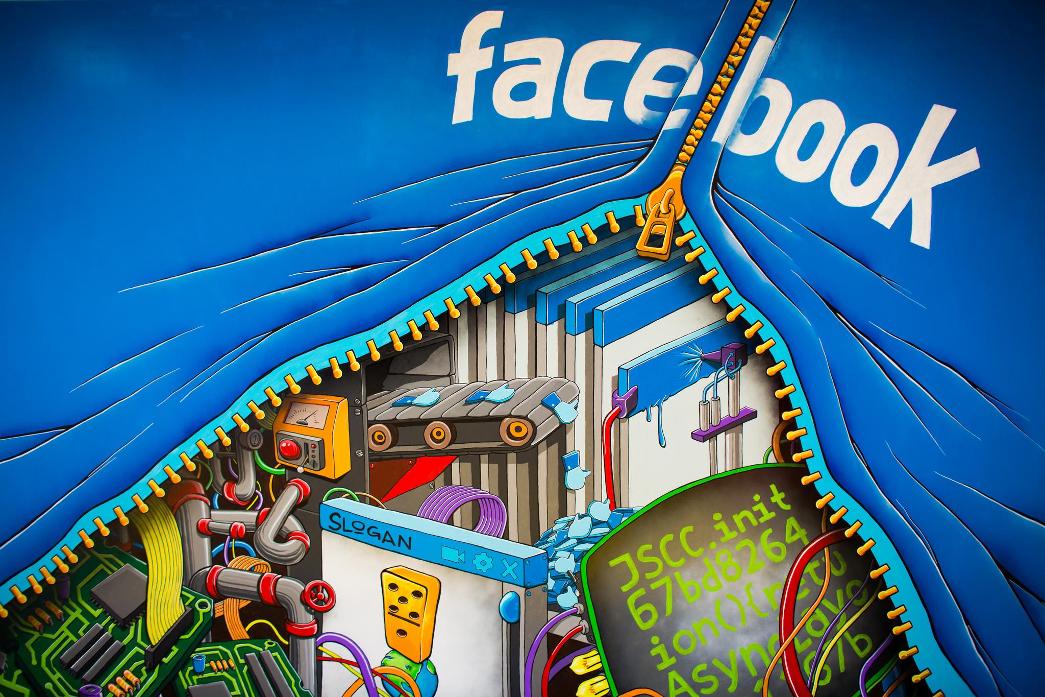
I wanted to start the process by using Facebook's own visual language to tie the design of the campaign to the social media website. I also liked the look of the fists and of hands snapping guns like twigs. Naturally, this led to the idea of using Facebook's ubiquitous “Like” hand as a starting point.

Unfortunately, this was neither new nor exciting, and the feedback I received reflected the fact that my image was pretty cliché. My second round of designs still centred on the “Like” hand, but instead of the thumbs-down position, I used a fist.

This is when things began to get interesting. The red colour (because it reflected our revolutionary, Cold War palette) caught people's attention, and the fist imagery was also a hit.

The sharper of the two fist images (on the right) won out in the email critique wars, so I continued tinkering with the design. One of my colleagues also suggested ditching the monotone palette for a more colourful look (the results of which you can see below). This colleague's suggestion really moved my design in the right direction, and the more colourful image on the right was the overwhelming favourite.

The final image was simply a more refined version of the image above. I ended up distressing the entire background to look like a block-print. Then, I placed an paper texture over the image in Photoshop enhance the antique look. The result? The image you see below.