A special example of datamapping at Wired recently shows the racial segregation in the United States. It is special for a number of reasons.
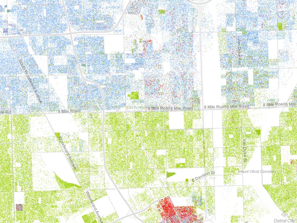
The map is made by Dustin Cable of the University of Viginia. Drawing on data from the 2010 U.S. Census, it shows one dot per person, color-coded by race. That’s 308,745,538 dots in all–around 7 GB of visual data. This isn’t the first map to show the country’s ethnic distribution, nor is it the first to show every single citizen, but it is the first to do both. The datasets of the US Census are available as open data.
In The Netherlands we can not only be amazed by the stunning comprehensive map, but also by the fact that this data is available. In the Dutch administration (called GBA), the ethnical background of people is not part of the dataset and the data is not publicly available anyway.
The details of this US map shows remarkable details. In Detroit, among the most segregated cities in America, 8 Mile Road serves as a sharp dividing line (see the illustration above). Every city tells a different story. White people are shown with blue dots on the map; African-Americans with green; Asians with red; and Latinos with orange, with all other race categories from the Census represented by brown.


