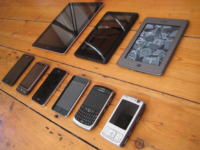
Nowadays, surfing the internet does not only apply to traditional desktop browsers. We are using the Internet in the train, on our bikes, during traffic jams or on the sofa in the livingroom. An enormous growth of devices, screen resolutions and browsers have been developed these days.
Alternative method for developing websites
We need to work towards a flexible webdesign, instead of making separate websites and mobile websites with subdomains (m.mydomain.nl) and different stylesheets. A webdesign needs to work wether you visit the site on tablets, smartphones or desktops. It even needs to be optimized for feature innovative devices. We can achieve that by using Responsive Design principles, which help us in thinking beyond the desktop and make sure we craft designs that anticipate and respond to the users needs.
Workshop Responsive design
On the 9th of May, I followed a Responsive design workshop during the Mobilism Conference Amsterdam by Lyza Gardner & Jason Grigsby (Cloud four). They focused on making a developer and designers work easier and they gave us some of the latest tips and tricks:
- Basic tools: use boilerplate to make the start of your project easier.
- Optimise pictures for different screenresolution and pollyfills to give backward compatibillity for older browsers.
- Design and develop the mobile website first.
- Responsive design in webapp development needs to focus on Local Storage, Simple json storage and app cache.
Conclusion
Responsive Design is a method that we need to keep in mind and develop on. The webcommunity (w3c, whatwag) embraces the principles of this designmethod as well. The only problem is that it’s still too much about technique. This causes the method to be more populair in the field of front end development. I had a few chats with other designers during the Mobilism Workshop and I found out that most designers are not interested in technical namedropping with terms such as ‘mediaqueries’, ‘polyfills’ and ‘browser optimization’. They want to see the possibilities of Responsive Design.
There’s still a lot of work to do in order to make responsive design a sovereign principal, both technically and design related. I think it could be very helpfull to develop toolkits for webteams (developers, designers and writers), just as is common with Interaction Design and Software Development. This will create more possibilities for all the teammembers involved.