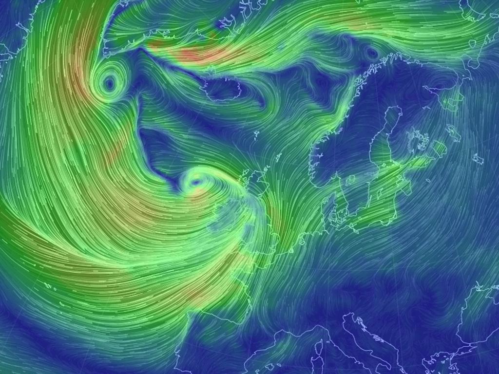
Cameron Beccario, a software engineer, created an interactive map that shows near real-time currents of Earth’s wind using data from the U.S. National Weather Service, the 'Earth Wind Map'.
Similar maps for the United States and other areas have been developed before, but this one takes a global look that allows users to zoom in and out to see the currents in stunning detail. You can also click and drag to move around the globe.
“Gentle breezes are thin strands of green, strong winds are long streaks of bright yellow, while the strongest currents are an angry red” , wrote The Verge earlier about this map. “‘Earth’ is a personal project I’ve used to learn JavaScript and browser programming, and is based on the earlier Tokyo Wind Map project”, Beccario wrote on the GitHub site where he posted the source data.
More info about the map can be found here. The top image shows the situation in Western Europe on 23 December 2013 at 13.00 hrs.