By: Pieter Stapel
Who wants to do the Dutch Design Week 2013 (DDW13) in just one day has to make choices, as there is an overflowing supply. I decided to go for the main expositions this time, being Designing Health at the Designhuis, the Graduation Show of the Design Academy an the main expo at the Klokgebouw plus the Dutch Design Awards at Strijp-S.
At the exhibition Designing Health, curated by Sabine Wildevuur of our Creative Care Lab, the role of the designer in health care technology is covered. A neatly arranged and restrained kind of display gives you the opportunity to really explore the subject. At many showcases an enlightening video is present, in some cases sorely lacking (as is the case at the ‘quantified self’ urine research ‘Aqua Vita’ by Susana Cámara Leret and Mike Thompson). The explanations are presented on boards that are leaning somewhat carelessly at the sides of the objects. The ones with the pixelated lettering in capitals are not so easy to read...

(Left: board with in pixel lettering - right: Graduation Show Design Academy)
Then, I visited the graduation projects by the students of the Design Academy, traditionally on the upper floors of the 'White Lady' building in the centre of Eindhoven. A crowded and warm place, with a avalanche of concepts, prototypes and ideas. Not all projects are equally clear, but generally speaking the presentations are very well made. Even so, it helps when the creator stands besides it to explain things. Our concept developers could probably start right away with the well worked-out ‘Creative Jam Toolkit’, that can be used to collaborate on large rolls of paper on a table. The centrally positioned installation ‘Splendour Lender’ by Jelle Mastenbroek drawed a lot of attention. He made a slot machine from an old porcelain drawer, that lets a coin tingle over the plates inside. Also intriguing: a stool so sturdy that it comes with a 500-year guarantee by its maker.
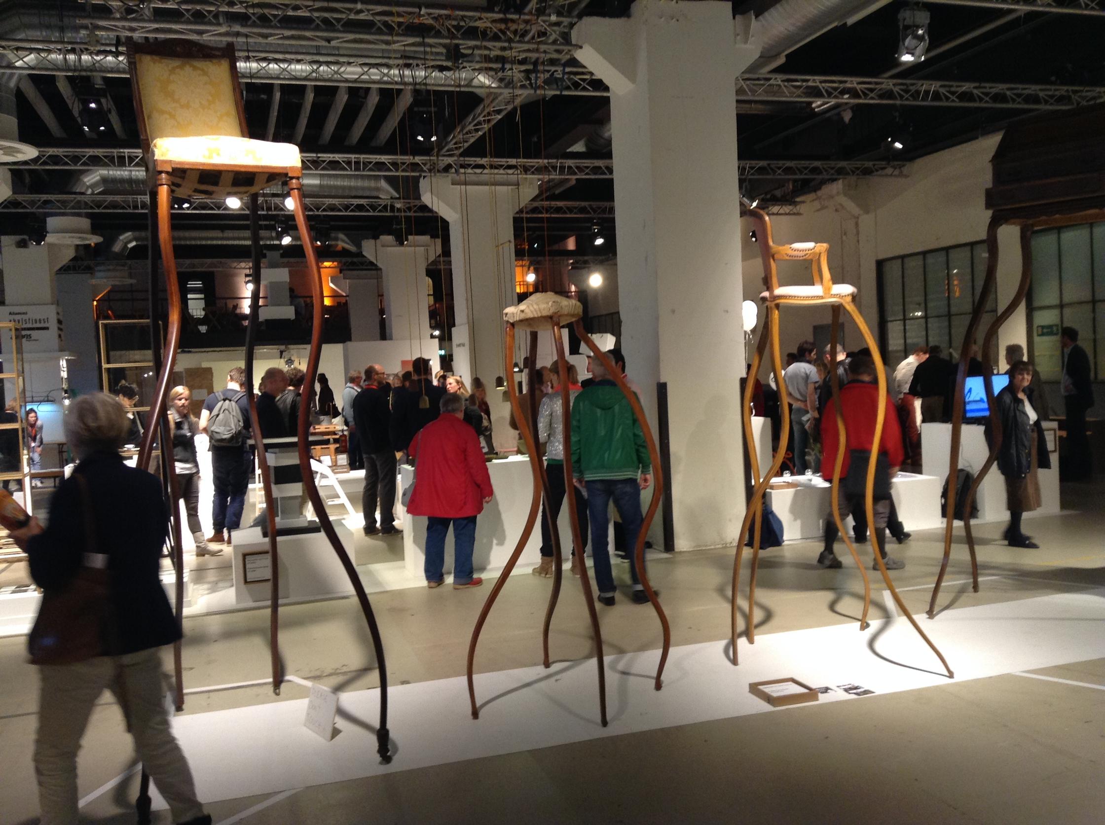
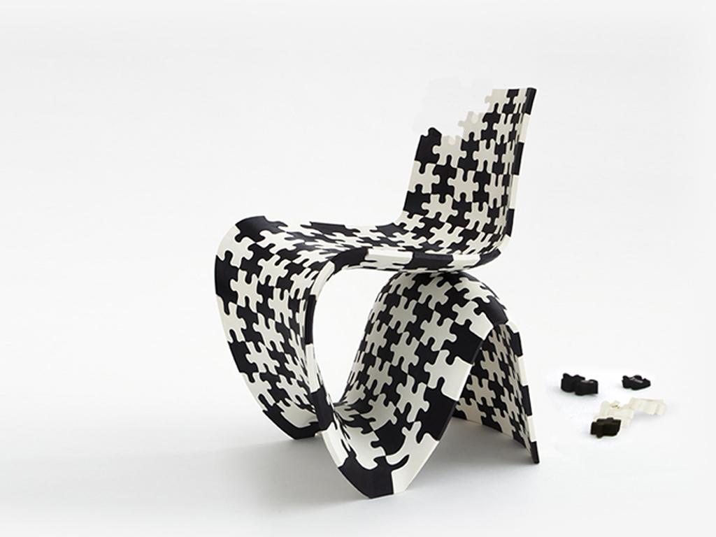
When visiting the Klokgebouw right after that, you will be submerged in the more traditional, professional design world. Mainly (household) products and objects and many, many curved edges. Most surprising thing was to find the Lilly-bot of MIT here, to cultivate your own algae at home. What it is doing between all those vases, chairs and tables I can't tell.

(From left to right: Creative Jam Toolkit, a stool with 500-year guarantee and the Lilly-Bot)
At the expo of the nominees and winners of the Dutch Design Awards, you can find Arne Hendriks' ‘Incredible Shrinking Man’ project next to Fairphone, suddenly reduced to a sqare meter display between so many other projects. This in large contrast to the numerous commercial stands outside, making the whole terrain become more like a logo festival. It's not about the form or what you represent there, it just has to have your logo printed all over the place. Getting back to the centre, you can find a branch of the Mediamarkt store. You can tell, because it has written its logo all over the place. Just in case you forgot.


